PMA USA is an insurance marketing powerhouse — a group of extraordinarily successful agents across 28 states who have spent over 25 years helping Middle America protect their health, finances, and futures. When the time came to give their website a redesign, the goals were clear: sharpen the messaging, showcase their videos, and ground the visual identity in the people and places PMA USA actually serves.
My role on this project was website design. Full credit for the development, build, and project management goes to the excellent team at Paragon Digital Marketing, who handled the technical execution from start to finish and kept the entire project running smoothly. It was a seamless and productive partnership.
A New Visual Direction: Rural America at the Center
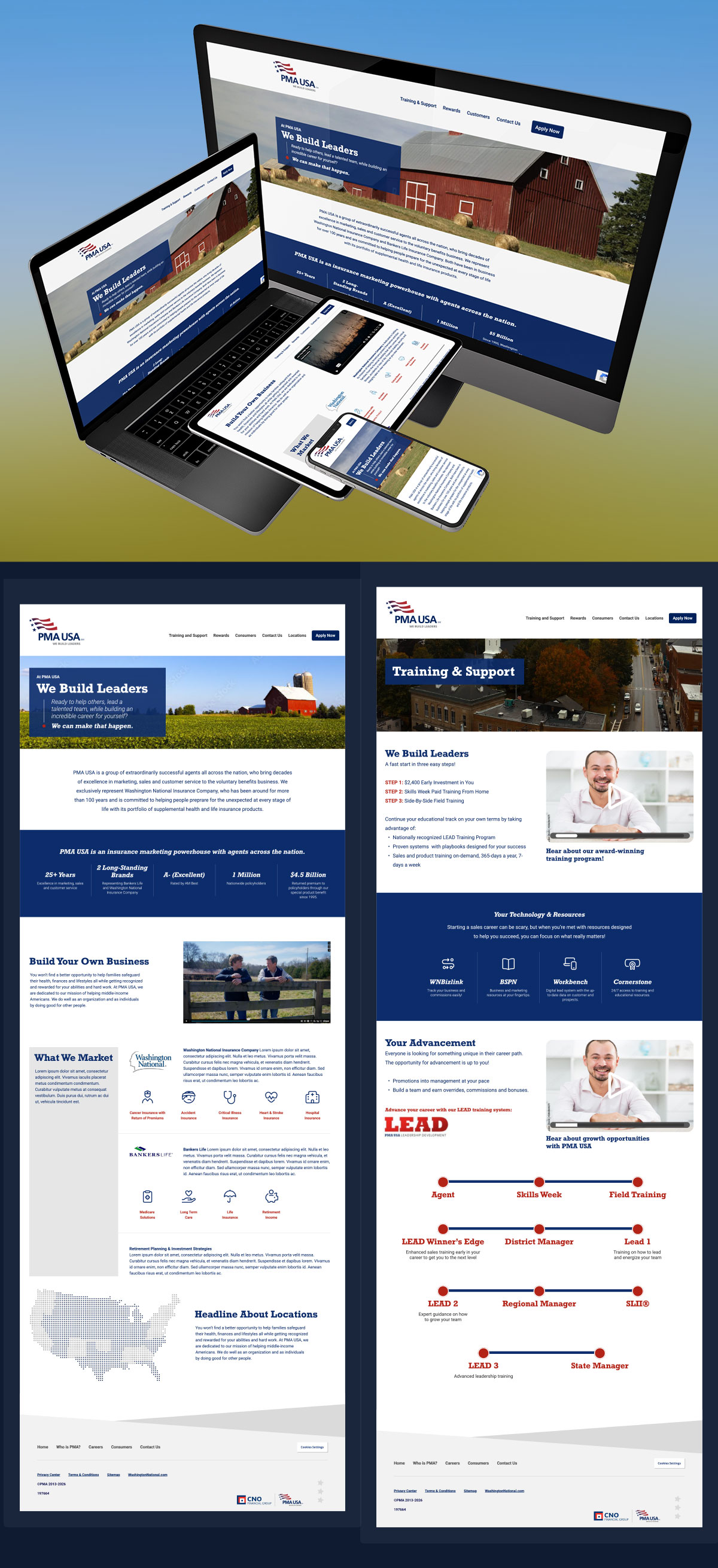
One of the most defining decisions in the redesign was the choice of imagery. PMA USA’s agents serve Middle America. Small towns, rural communities, and working families in the heartland who need reliable supplemental health and life insurance coverage. The new site puts that world front and center, with photography that celebrates the landscapes, farms, and quiet dignity of small-town rural America.
It’s a deliberate and meaningful shift. Rather than defaulting to the polished corporate imagery common in the financial services industry, the new PMA USA site feels grounded and genuine — red barns, open farmland, and the kind of honest American imagery that speaks directly to the communities PMA USA agents call home and the customers they serve every day. For a company whose mission is helping Middle America, it only makes sense that Middle America should be visible throughout the site.
Clearer Messaging
The redesign also brought a sharper focus to PMA USA’s core message. The headline “We Build Leaders” — paired with the direct, conversational subhead “Ready to help others, lead a talented team, while building an incredible career for yourself? We can make that happen.” — establishes immediately what PMA USA is and who it’s for.
Throughout the site, the copy and layout work together to present a clear, organized picture of the PMA USA opportunity: who they are, what they market through their two long-standing partner brands Washington National Insurance Company and Bankers Life, their impressive track record of over 25 years and one million nationwide policyholders, and the defined career path available to new agents through their LEAD training program. The redesign strips away ambiguity and replaces it with confidence and clarity.
A New Focus on Video
The redesign places video at the heart of the site experience in a way the previous version did not. PMA USA has a compelling story to tell — about leadership, about community, about the real impact their agents have on the families they serve — and video tells that story better than any static page can.
Embedding video prominently throughout the site gives prospective agents and customers a more immediate, human connection to the brand. It’s one of the most impactful changes in the new design, and one that will only grow more valuable as PMA USA continues to build out its content library.
Responsive Across Every Device
As the portfolio image shows, the new site is designed to perform beautifully across desktop, laptop, tablet, and mobile. For a network of agents spread across 28 states who are as likely to pull up the site on a phone in the field as on a desktop in an office, that responsiveness isn’t optional, it’s essential.
The new PMA USA site is live now at pmausainc.com. It’s a design that takes a great American company and gives it a digital presence worthy of the communities it serves.