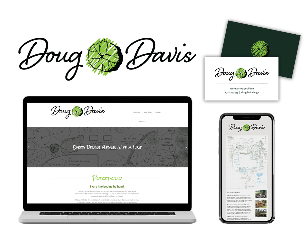
Logo Design, Business Cards, Website & Email Announcement
Some design projects call for bold geometry, striking color, and visual complexity. Others call for something quieter — something that feels personal, handcrafted, and true to the person behind the business. The brand identity for Doug Davis Design was firmly in the second category, and finding the right approach made all the difference.
Doug Davis is a landscape designer with a distinctive specialty: every schematic he produces is drawn entirely by hand. In an industry that has largely moved to digital rendering tools, his hand-drawn work stands apart, it carries a warmth, a precision, and a human quality that software simply can’t replicate. The brand identity needed to say all of that before a single word was read.
The Logo: Craft Meets Character
The central design challenge was creating a logo that felt like an authentic expression of Doug’s work and personality, not a generic mark that could belong to any landscape business, but something unmistakably his.
The solution came together around two complementary ideas. First, his name is set in a flowing script font, lending the wordmark the feel of a personal signature. For a business built on the intimacy and skill of hand-drawn work, there’s no more fitting choice. A script treatment communicates artistry, individuality, and the human touch that defines everything Doug does.
The second element is where the logo truly comes alive. Nestled between “Doug” and “Davis” is a small illustration of a bush, rendered in the precise style of a landscape schematic, exactly the kind of mark Doug himself would make on one of his drawings. It’s a moment of wit and authenticity that works on two levels: it visually breaks the name in a way that creates rhythm and balance, and it tells you instantly what kind of designer Doug is. The logo doesn’t just represent the business — it demonstrates it.
Business Cards
With a logo as personal and distinctive as this one, the business cards needed to carry that same character into a physical format. The card design gives the logo room to breathe while providing all the essential contact information in a clean, uncluttered layout that feels consistent with the hand-crafted aesthetic of the brand.
A business card from Doug Davis Design should feel like something worth holding onto — the kind of card you set on your desk rather than toss in a drawer.
Website
A basic but well-considered website gives Doug Davis Design a professional home on the web — a place where potential clients can find him, understand his work, and get in touch. The site carries the visual language of the logo throughout: the script wordmark, the schematic-style illustration sensibility, and a warm, personal tone that reflects the nature of his craft.
The goal wasn’t complexity — it was clarity and character. A landscape designer whose work speaks for itself needs a website that gets out of the way and lets that work take center stage.
Email Announcement
To introduce the new brand to Doug’s network, I also designed a launch announcement email. This piece gives existing contacts and potential clients their first look at the new identity — a warm, professional introduction that communicates the care and intentionality behind the brand while inviting people to visit the new site and reach out.
A well-designed announcement email does more than share news. It sets the tone for how the brand will show up going forward, and signals to everyone who receives it that Doug Davis Design is a serious, professional operation.
There’s a special kind of satisfaction in creating a brand identity that feels genuinely true to the person it represents. Doug’s work is personal, skilled, and human — and the brand we built together reflects exactly that. It was a pleasure to help him put his best foot forward.