
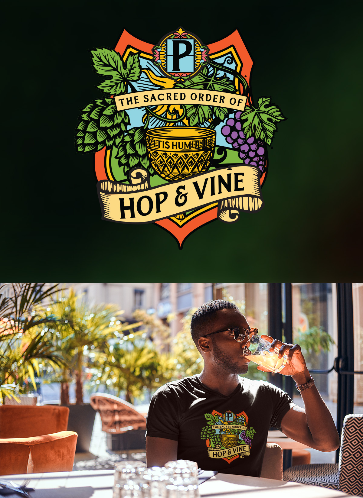
The Platz Beer Garden creative partnership keeps getting more fun. What began as a ground-up brand identity project (logo, brand guide, print materials, and all the foundational pieces) grew into a full website design, and now into something I genuinely didn’t expect to be illustrating when this relationship started: a secret society crest.
The Sacred Order of Hop & Vine is Platz’s exclusive loyalty program, a membership experience for the venue’s most devoted patrons, offering early access, exclusive gatherings, special perks, and the kind of insider belonging that turns a favorite bar into a true community. A program like that deserves its own identity, one that feels completely distinct from the primary Platz brand while still living in the same creative universe. It needed gravitas, personality, and a healthy sense of drama.
A heraldic crest was the obvious answer. And it was an absolute joy to illustrate.
Designing the Crest
The design language for this piece is rooted in the rich tradition of heraldic illustration, the kind of detailed, layered, symbol-laden imagery you’d find on a medieval coat of arms or a classic brewery label. Every element in the crest earns its place, and each one tells part of the story of what Platz is and what this membership represents.
At the center of the composition sits a large golden chalice inscribed with Vitis Humulus — the Latin botanical names for grape (Vitis) and hops (Humulus), the two plants that produce wine and beer respectively, and the two pillars of Platz’s beverage program. It’s a small detail that rewards the curious and signals immediately that this is a brand that takes its craft seriously.
Flanking the chalice are the program’s two namesake plants in full illustrated glory: a lush cascade of hop vines and leaves on the left, and a heavy cluster of deep purple wine grapes on the right. Both are rendered with the kind of botanical richness that gives the crest its visual weight and makes it feel genuinely handcrafted.
The shield behind the central imagery is bold and layered — rich greens, burnt orange, and gold working together in a palette that feels simultaneously classic and vibrant. At the crown of the shield, the Platz “P” monogram sits in a decorative cartouche, tying the crest directly back to the parent brand. Scrollwork, ornamental flourishes, and a banner bearing “The Sacred Order of” complete the composition above the bold “Hop & Vine” wordmark across the bottom.
The result is a mark that feels like it has existed for centuries, even though it was created for a brand new venue. That sense of invented heritage is exactly what a great secret society crest should project.
On the Merch
As you can see in the portfolio image, the crest translates beautifully onto apparel, a t-shirt bearing the Sacred Order mark is exactly the kind of piece a loyal Platz member would be proud to wear. The richness of the illustration holds up at print size, and the dark shirt backdrop gives the full-color crest the same dramatic quality it has on screen.
Three Platz projects in and this creative relationship continues to be one of the most enjoyable in my portfolio. Every new piece adds another layer to a brand that is being built with real intention and real craft. I can’t wait to see it all come to life when the doors open in Keene. Prost! 🍺


