Logo Design & Brand Identity
There are projects where the concept comes together almost effortlessly, where the name of the business, the right imagery, and the client’s personality all point in the same direction at once. The brand identity for Side By Side Speech Therapy was exactly that kind of project. From the very first conversation, the creative direction was clear, and the result is a brand that feels genuine, warm, and purposeful.
Finding the Visual Language
The name “Side By Side” carries a lot of meaning for a speech therapy practice. It speaks to partnership, presence, and the kind of patient, supportive relationship that defines good therapeutic work. A therapist and a client, walking through a challenge together. That idea needed to be at the heart of the logo.
The client came in with a strong sense of her own aesthetic: soft blues and greens were her favorite colors, and she had a natural affinity for nature imagery. Those preferences became the foundation for everything. Rather than steering toward clinical blues or sterile white space, the palette leans into something warmer and more organic — colors you might find in a quiet, peaceful forest on a clear morning.
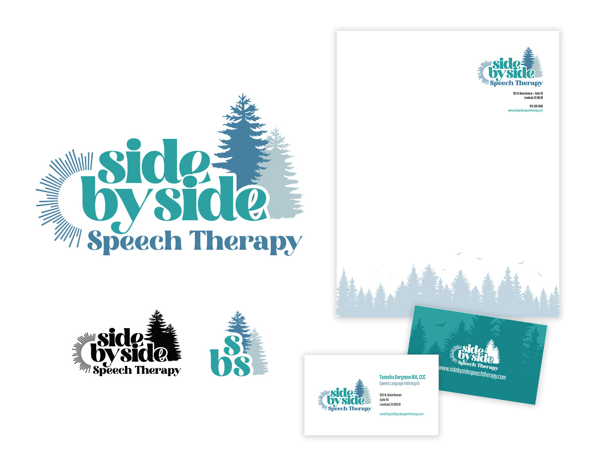
The Logo: Two Trees, One Forest
The central image in the logo is two tall pine trees standing side by side. It’s a simple concept that works beautifully on multiple levels. The trees evoke a forest setting, grounding the brand in nature and creating a sense of calm and safety. At the same time, they are an unmistakable visual metaphor for the “side by side” relationship at the core of the practice. Two distinct forms, rooted in the same ground, growing together.
Pine trees specifically carry a timeless, sturdy quality. They suggest patience, resilience, and quiet strength — all qualities that resonate deeply with what a speech therapist brings to their work with clients. The illustration style keeps the trees clean and approachable rather than overly detailed, ensuring the mark reads well at any size.
The soft blue and green palette wraps around the imagery with a cohesion that feels intentional without being rigid. These are colors that invite rather than announce, which is exactly the right tone for a therapy practice.
Logo Variations
A well-built logo system is ready for any context. Beyond the primary full-color mark, I developed a solid single-color version for applications where the full palette isn’t available, such as embossing, single-color printing, or promotional items. I also created a simplified icon version of the two-tree illustration for use as a social media profile image and other small-format applications where the full wordmark would lose its impact.
Together, the three versions give Side By Side Speech Therapy everything they need to show up consistently and professionally across every touchpoint.
Business Card & Digital Letterhead
With the logo family complete, the identity was extended into two essential pieces: a business card and digital letterhead.
The business card brings the full brand to life in a tangible format, using the soft color palette and tree imagery to create something that feels distinctive and memorable. A well-designed card communicates professionalism before a word is spoken, and for a new practice building its client base, that first impression matters.
The digital letterhead gives Side By Side Speech Therapy a polished, consistent format for all written communication, from intake forms and treatment notes to correspondence with families and referral partners. Every document that leaves the practice carries the same visual identity, reinforcing the brand with every interaction.
Building a brand for a new practice is always meaningful work. For a speech therapist starting fresh, the identity we create together is how the world meets them for the first time. I’m proud of what we built for Side By Side Speech Therapy and excited to watch the practice grow into it.


