Conference Artwork & Digital Assets
Fourteen years. That’s how long I’ve had the privilege of creating the artwork for the Joint Defense Veterans Audiology Conference, the annual gathering of the Military Audiology Association (MAA) and the Association of VA Audiologists (AVAA). Every year brings a new city, a new theme, and a new creative challenge, and every year I’m reminded of why this project holds such a special place in my work.
This is one of those long-term client relationships that has become genuinely meaningful. When you’ve been the creative voice behind a conference for fourteen consecutive years, you develop a deep understanding of the audience, the culture, and what makes the artwork land year after year. I’m proud of every iteration, and this year’s may be my favorite yet.
The Conference: JDVAC
The Joint Defense Veterans Audiology Conference brings together the members of two important organizations: the Military Audiology Association and the Association of VA Audiologists. These are the professionals dedicated to protecting and restoring hearing for the men and women who serve our country, a mission that carries real weight, and an audience that deserves event materials worthy of their work.
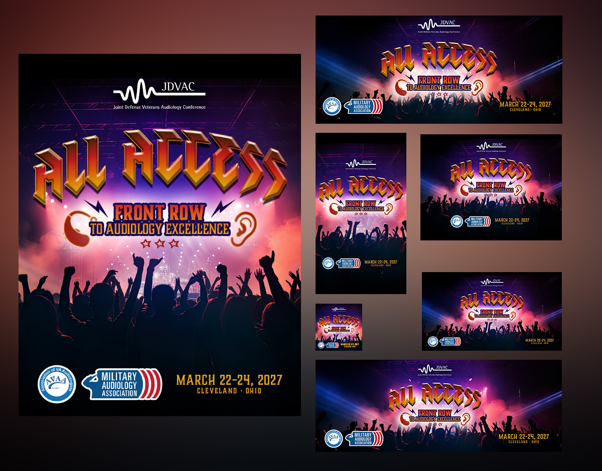
The conference rotates cities each year, and the host city always serves as the creative springboard for the artwork. This year, that city was Cleveland, Ohio, and Cleveland handed us something pretty remarkable to work with.
The Inspiration: Rock and Roll Hall of Fame
Cleveland is home to one of the most iconic cultural institutions in the country: the Rock and Roll Hall of Fame. The building itself is a striking piece of architecture, the music it celebrates is woven into the fabric of American life, and the energy it projects — bold, electric, timeless — was a perfect match for the spirit of a major professional conference.
The creative concept draws directly from the Rock and Roll Hall of Fame aesthetic. The the bold graphics and typography associated with rock culture, all of it found its way into the artwork in a way that feels celebratory and immediately recognizable to anyone who knows Cleveland.
The goal was artwork that would make attendees genuinely excited to be there. When you see the conference branding and it puts a smile on your face before you’ve even registered, the design is doing its job.
From Concept to Campaign
Once the central concept was established, the artwork was adapted across a full suite of digital assets to ensure consistent, professional branding at every touchpoint of the conference experience.
The core design was translated into variations sized and optimized for the conference website, social media platforms, and a variety of digital screens used throughout the event itself. Each variation maintains the integrity of the original concept while being tailored to perform at its best in its specific context.
This kind of systematic rollout is where the real craft lives. The concept is the spark, but the execution across every format is what makes a conference feel cohesive, polished, and professionally produced from the first online impression all the way through the final session.
Fourteen years in, and this project still energizes me every time it comes around. There’s something special about being trusted with the visual identity of an event year after year, watching it evolve, finding new creative directions, and knowing that your work is part of the experience for hundreds of audiology professionals who do important work for our nation’s veterans. Here’s to year fifteen. 🤘