
Promotional Print Design
Bridge Body Clinic + Training Center holds a special place in my portfolio. When they made the exciting transition from Solstice Clinic + Training Center to their own independent practice, I had the privilege of building their brand identity from the ground up — the logo, the color palette, the typography, the corporate identity pieces, and the environmental graphics that now greet patients at their Atlanta location. It’s the kind of foundational design work that’s deeply satisfying to be part of.
So when Bridge Body came back to promote a new service offering, it was a genuine pleasure to return to a brand I know intimately and put it to work in a new context.
Designing Within an Established Brand
One of the distinct advantages of having built the Bridge Body brand myself is knowing exactly how to extend it. The bold gold, orange, and deep blue palette; the clean, modern typography; the four upward lines that serve as both a logo element and a unifying accent — all of it was already in place and ready to be deployed. The goal with these new pieces wasn’t to reinvent anything, but to make sure the brand showed up consistently, confidently, and compellingly across two very different formats: yard signs and a trifold brochure.
Consistency across touchpoints is how a brand builds trust. When a potential client sees a yard sign outside the clinic and then picks up a brochure inside, those two pieces should feel like they came from the same place — because they did.
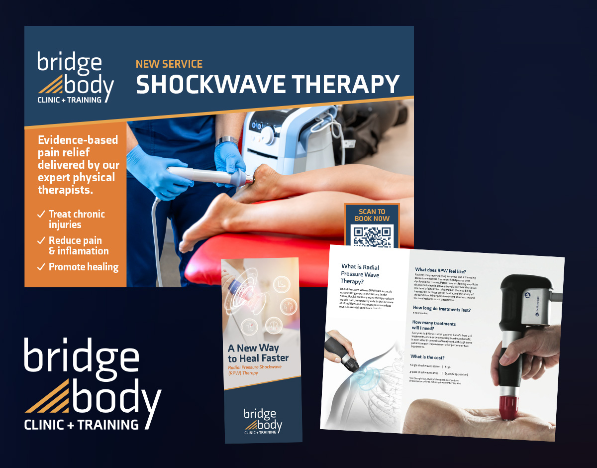
Yard Signs
Yard signs are a deceptively simple format. The design challenge is significant: you have a small amount of space, a viewer who may only glance for a second or two, and a message that still needs to land. Every element has to earn its place.
The yard signs were designed to grab attention and communicate the new service quickly and clearly, drawing on the established Bridge Body visual language to ensure instant brand recognition. Bold typography, the Bridge Body color palette, and clean, uncluttered layouts do the heavy lifting — making sure the signs are readable from a distance and immediately associated with the clinic.
Trifold Brochure
Where the yard signs are built for a quick impression, the trifold brochure is built for a deeper conversation. This piece is designed to be placed in the hands of current patients and prospective clients alike — giving them something tangible to take home, read at their own pace, and reference when they’re ready to take the next step.
The brochure walks through the new service offering in a clear, organized format across the six panels of the trifold, guiding the reader from introduction to details to a clear call to action. The design carries all of the familiar Bridge Body brand elements throughout — the accent lines, the color palette, the typography hierarchy — so the piece feels like a natural, professional extension of the brand rather than something produced in isolation.
Working with a client whose brand you helped create is one of the most rewarding experiences in design. You already share a common visual language, a mutual understanding of what the brand stands for, and a level of trust that makes the creative process smoother for everyone. Bridge Body continues to grow, and it’s an honor to grow alongside them.